How to Select Widget Template and Set Icon for Wizard Steps
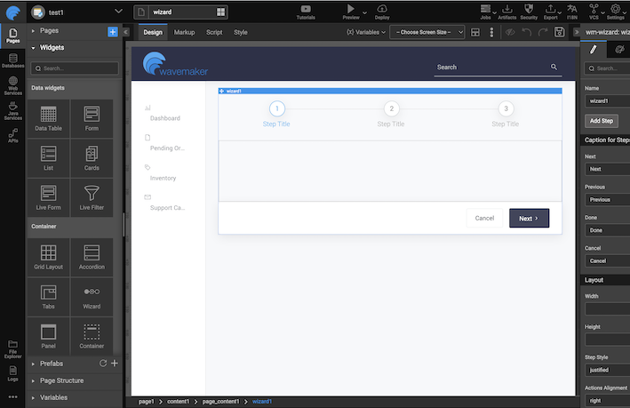
In this document, learn how to change the template and layout of the Wizard widget. There are four types of Wizard templates that support both horizontal and vertical alignments.
- Number
- Icons-stepper
- Dotted-stepper
- Classic.
Choosing Widget Template from Canvas
- Drag and drop a Wizard widget.
- Select the Wizard widget on the canvas, and expand the layout icon on the toolbar.
- Click the Layout icon.
- A dropdown displaying the list of available widget templates appears.
![]()
Number Widget Template
Wizard steps in the Number template are identified by numbers starting with 1.

Dotted Stepper Widget Template
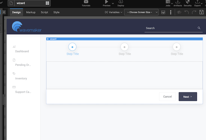
In comparison, the dotted-stepper places a dot in each wizard step.

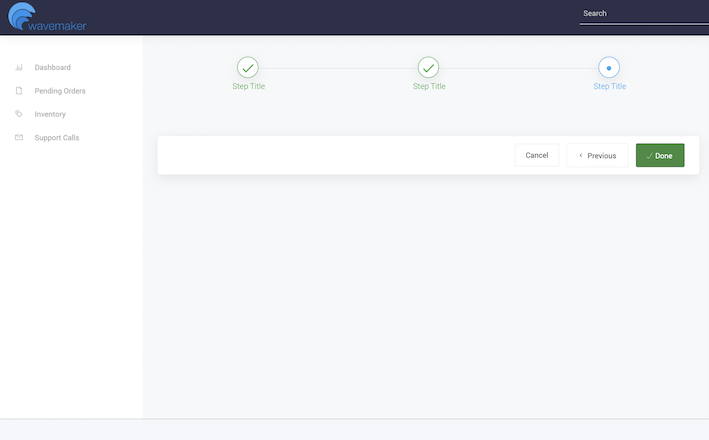
Upon visiting a specific step, the step style changes from a number or dot to a Done icon.

Properties
There is an icon-stepper wizard with two properties to choose from.
- Title Icon Class
- Done Icon Class
Title Icon Class Property
The Title Icon Class property is used to set the icon class for the individual step in the unvisited state of a step in the wizard.
![]()
Done Icon Class Property
The Done Icon Class property is used to set icon class for the individual step in the visited state of a step in the wizard.
![]()
By default, this property will is set to wi wi-done, meaning the visited steps for all the available wizard layouts will show checked-circle as the icon.