Form Factor: Customize Breakpoints for Device Widths in Show in Devices
The objective of a web design project is to provide a versatile and user-friendly interface for presenting data. WaveMaker platform provides customization options to display the same dataset in two different formats: as a table and as a list.
The choice of presentation format adapts to various form factors, which encompass different devices like desktop computers, laptops, tablets, and mobile phones. By tailoring the data's appearance to suit the user's device and preferences, this approach aims to enhance user experience and accessibility across diverse web platforms.
Configure a widget in different devices
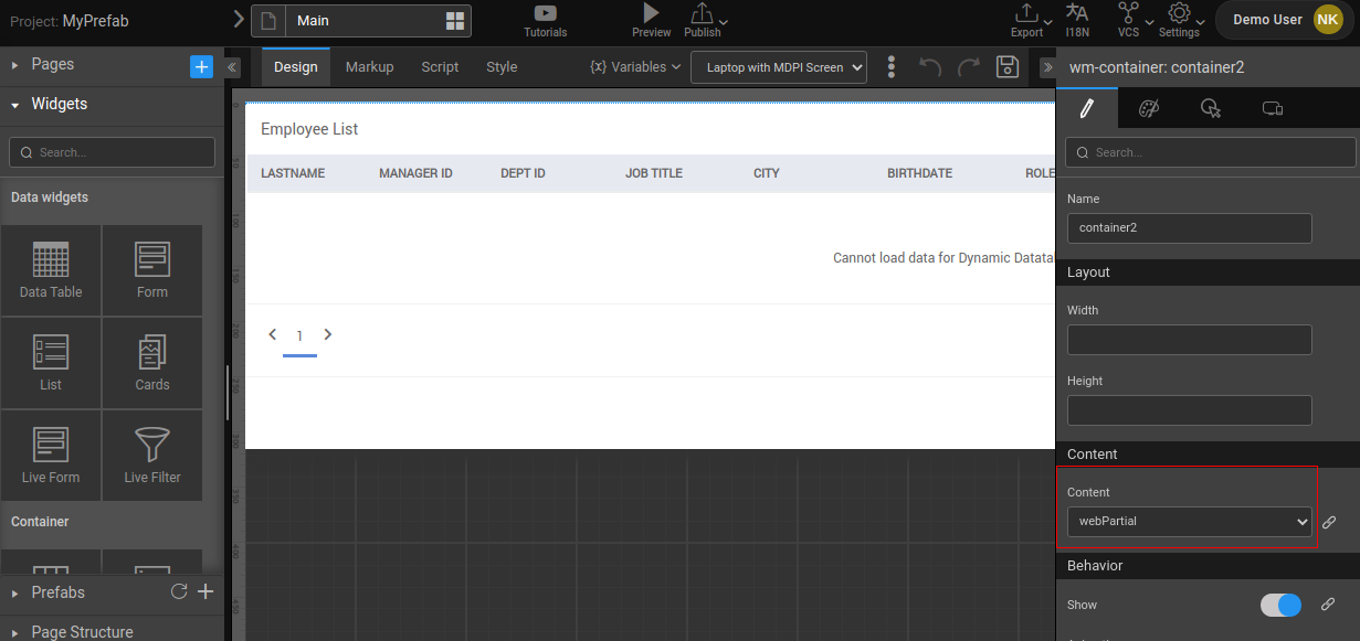
- Drag and drop a Data Table widget on the canvas.
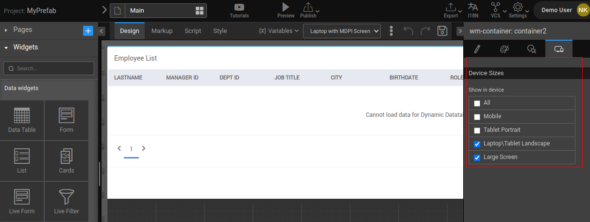
- For web view, go to the Device tab and choose a Show in device property as Laptop\Tablet Landscape and Large Screen.
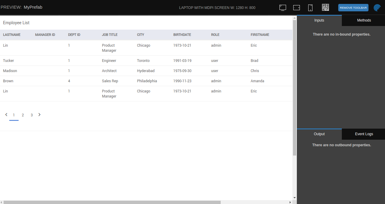
- Preview the App. The Laptop view shows us the Data Table.
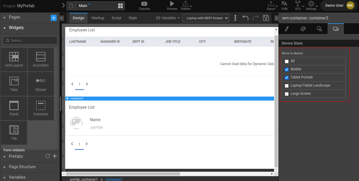
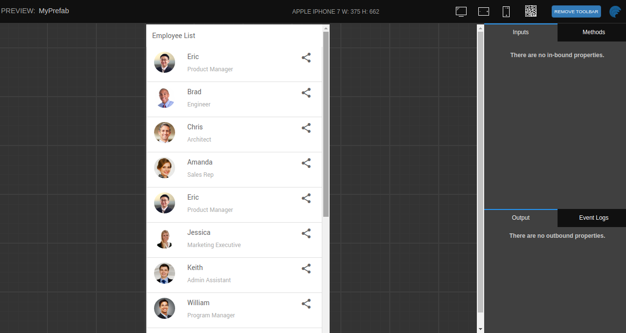
For mobile view, Drag and drop a list widget on the canvas.
Go to the Device tab and choose Show in device as Mobile and Tablet Portrait.
- Preview the App. The Mobile view shows us the list
- Current default values for the breakpoints of the devices.

Customize the breakpoints
- The breakpoint widths of these devices can be configured through css variables in app.css file or in the variable.less file of the theme folder. This block of css needs to be added at the beginning of the file as this applies on the root element(html tag).
:root {
–screen-xs: 400px;
–screen-sm: 500px;
–screen-md: 992px;
–screen-lg: 1250px;
–screen-lg-tab-landscape: 1050px;
–screen-lg-tab-portrait: 900px;
}
- Avoid choosing device sizes for both parent and child containers when dealing with nested containers. Selecting the device size for the parent container is sufficient.
The incorrect way to use the "showindevice" directive is as follows:
<wm-container name="container8" showindevice="md,lg">
    <wm-container name="container7" showindevice="md,lg">
        <wm-label padding="unset" name="label7" caption="1"></wm-label>
        <wm-anchor margin="unset 0.5em" name="anchor" caption="Increment" on-click="anchorClick($event, widget)"></wm-anchor>
    </wm-container>
</wm-container>
The proper way to utilize the "showindevice" directive is as follows
<wm-container name="container8" showindevice="md,lg">
    <wm-container name="container7">
        <wm-label padding="unset" name="label7" caption="1"></wm-label>
        <wm-anchor margin="unset 0.5em" name="anchor" caption="Increment" on-click="anchorClick($event, widget)"></wm-anchor>
    </wm-container>
</wm-container>