Progress Circle
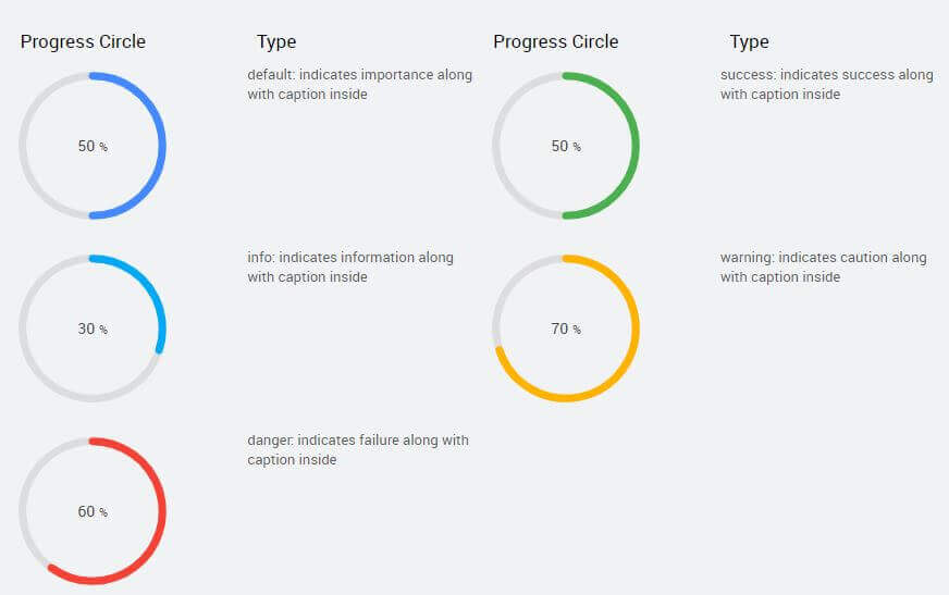
Progress Circle widget can be used to show the status of any given event. It can be used to represent the completion progress of a task. Progress may be either indeterminate — meaning it is unclear how much work remains before the task is complete (e.g., the task is waiting for a response from a remote host) — or a numeric value between 0 and a given maximum, explicitly specifying the fraction of work that has completed. 
Properties
| Property | Description |
|---|---|
| Title | Title of the progress cirle. |
| Subtitle | Subtitle of the progress circle. |
| Name | The name is a unique identifier for the progress circle widget. |
| Type | Indicates the format you want to use to display the progress circle. Choose from - default, - success, - info, - warning, - danger, |
| Accessibility | Hint Any text or an HTML you enter for this property will be shown as a tooltip if the mouse hovers over this widget for 1.5 seconds. |
| Layout | |
| Width | The width of your widget can be specified in px or % (i.e 50px, 75%). |
| Height | The height of your widget can be specified in px or % (i.e 50px, 75%). |
| Value | Set this property to a variable to populate the list of values to display. |
| Default Value | |
| Value | Value is the default value to display value for an editor widget. Note that the display value is just what the user sees initially, and is not always the dataValue returned by the widget. |
| Minimum Value | Enter minimum number for the Progress bar. |
| Maximum Value | Enter a maximum number for the Progress bar. |
| Behavior | |
| Show | Showing determines whether or not a component is visible. It is a bindable property. |
| Display Format | The format in which the progress needs to be displayed. You can choose from a list of decimal options like 9, 9.9, 9.99, etc. If the progress bar's data value is 30.7056 and the selected display format is: - 9.9 then label will be rounded as 30.7 - 9.999% then label will be rounded to 30.706% |
| Caption placement | Placement of progress bar value can be - inside or - hidden |
Events
| Event | Description |
|---|---|
| Mouse Events | |
| On-click | This event handler is called whenever the click event is triggered on a widget. |
| On-double click | This event handler is called whenever the double click event is triggered on a widget. |
| On-mouse enter | This event handler is called whenever the mouse enters the widget. |
| On-mouse leave | This event handler is called whenever the mouse leaves the widget. |
| Touch Events | |
| On-tap | This event handler is called whenever the tab event is triggered on a widget. |
| On-double tap | This event handler is called whenever the double tap event is triggered on a widget. |
| On-long tap | This event handler is called whenever the long tap event is triggered on a widget. Note: Long Tap event is only supported in React Native applications. |
| Callback Events | |
| On-start | This event handler is called on the start of the progress. |
| On-complete | This event handler is called on complete of the progress. |
| On-before update | This event handler is called on before update of the progress. |