Picture Widget
Display an image with a picture widget. Just drag and drop the Picture widget and bind it to the resource using the Property Panel.
Picture widget can be used by itself or within any widget like Live List, Data Grid, or Carousel and more. It can be bound to a database column containing the URL for the picture resource location. Example, the picurl field of Employee database from Sample DB.
Using Picture Widget
The following features are available for all the Picture widget.
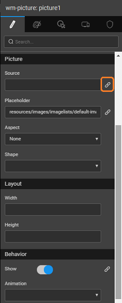
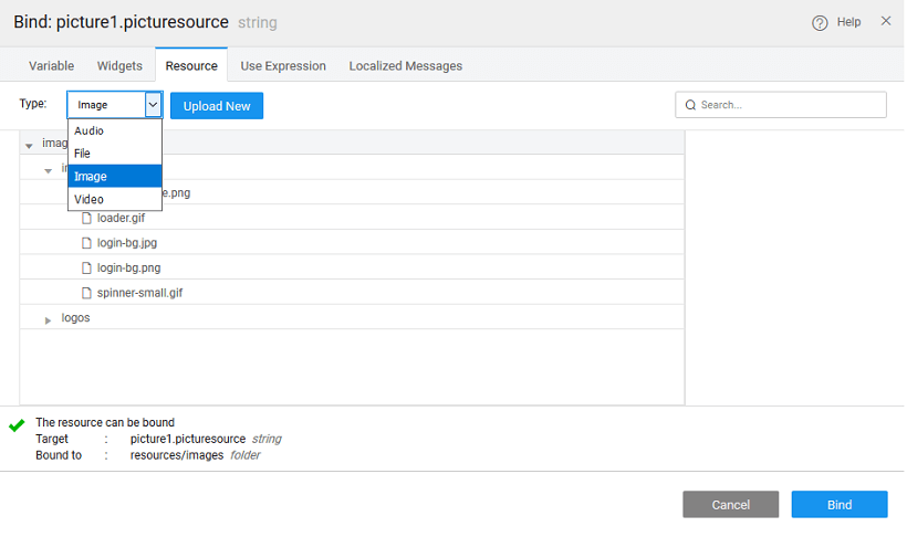
From the Property panel of the media widget, find the Source property. Click the Bind icon represented by a chain-link as shown in the picture below; a Bind modal dialog pops up.
In the modal dialog, click the Resource tab.
Select the Image type from the dropdown and click the Upload New button, the Import Image modal dialog pops-up.
Picture Customizations
You can add customizations from the Properties panel such as Width and Height with valid values. For example, 50px for Width, 75px for Height.
Picture Widget Properties
| Property | Description |
|---|---|
| Name | The name is a unique identifier for the picture widget. |
| Accessibility | |
| Hint | Any text or HTML you enter for this property will be shown as a tooltip if the mouse hovers over this widget for 1.5 seconds. |
| Tab index | The tab index attribute specifies the tab order of an element. You can use this property to change the default tabbing order for widget access using the tab key. The value can range from 0 to 32767. The default is 0 and -1 makes the element non-focusable. NOTE: In Safari browsers, by default, Tab highlights only text fields. To enable Tab functionality, in Safari Browser from Preferences -> Advanced -> Accessibility set the option "Press Tab to highlight each item on a webpage". |
| Picture | |
| Source | This property specifies the source for the picture. The source can be either a file or a URL - File: enter the directory and filename for the image to display (supported file types include .jpg, .gif and .png). By default, WaveMaker looks for images in the src/main/webapp directory of the project. Every WaveMaker project has a data directory under src/main/webapp, so this is a good place to put pictures. - URL: enter a URL to any internet-accessible image. To display the file, foo.jpg, in the project directory src/main/webapp/resources/images/imagelists/, enter the following into the source property:resources/images/imagelists/foo.jpg or simply foo.jpg |
| Placeholder | This property will act as placeholder image for the picture. When the picture from the Source value is not provided or not available then placeholder picture will be shown. |
| Aspect | This property can automatically size an image to the height or width of the picture widget. The options are: - none: the image is displayed at its default size - h: the image is resized so that the width of the image is the same as the width of the picture widget - v: the image is resized so that the height of the image is the same as the height of the picture widget - the image is resized so that the height and width of the image is the same as the height of the picture widget |
| Shape | This property controls the shape of the data point. Can be: - rounded, - circle, or - thumbnail |
| Layout | |
| Width | The width of your widget can be specified in px or % (i.e 50px, 75%). |
| Height | The height of your widget can be specified in px or % (i.e 50px, 75%). |
| Behavior | |
| Show | Showing determines whether or not a component is visible. It is a bindable property. |
| Load on Demand (visible only when show property is bound to a variable) | When this property is set and show property is bound, the initialization of the widget will be deferred till the widget becomes visible. This behavior improves the load time. Use this feature with caution, as it has a downside (as we will not be able to interact with the widget through script until the widget is initialized). When show property is not bound the widget will be initialized immediately. |
| Animation | This property controls the animation of an element. The animation is based on the CSS classes and works only in the run mode. |
| Encode URL | Check this if you want the provided URL to be encoded at the run time. Enabling this property will encode the special characters in the URL and enable rendering of the image which otherwise might fail. By default, it is set to false. |
Picture Widget Events
| Event | Description |
|---|---|
| Mouse Events | |
| On click | This event handler is called whenever the click event is triggered on a widget. |
| On double click | This event handler is called whenever the double click event is triggered on a widget. |
| On mouse enter | This event handler is called whenever the mouse enters the widget. |
| On mouse leave | This event handler is called whenever the mouse leaves the widget. |
| Touch Events | |
| On Tap | This event handler is called whenever the tap event is triggered on a widget. |
| On Double Tap | This event handler is called whenever the double tap event is triggered on a widget. |
| On Long Tap | This event handler is called whenever the long tap event is triggered on a widget. Note: Long Tap event is only supported in React Native applications. |

