Sliding left navigation for Mobile App
In this section we will see how to add a sliding navigation to your Mobile App. We will be adding an anchor widget to the topnav and the click event of this will slide open the navigation bar.
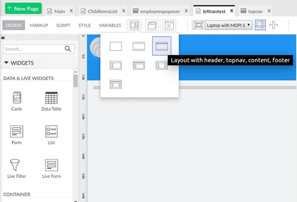
- For the Main page, choose the Layout with header, topnav, content and footer.
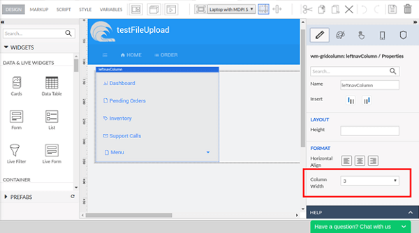
- Add a grid layout (let’s name it as leftnavColumn, this name will be used in further implementation) in the Main page content. For the gridcolumn first grid row, specify the columnwidth as 3.
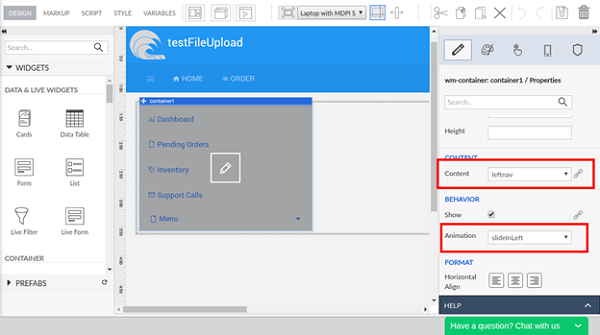
- Add a container in this grid column and choose the Content property for the container widget from the properties panel as “leftnav”. Here, we have added an animation for the container widget as “slideInLeft”. You can choose any animation as per your choice.
Hence, the markup should look as follows:
    <wm-header content="header" name="header" height="auto"></wm-header>
        <wm-top-nav content="topnav" name="top_nav1"></wm-top-nav>
        <wm-content name="content">
            <wm-page-content columnwidth="12" name="mainContent" padding="unset 15px">
                <wm-layoutgrid name="layoutgrid1">
                    <wm-gridrow name="gridrow1">
                        <wm-gridcolumn columnwidth="3" name="leftnavColumn" class="hidden">
                            <wm-container name="container1" content="leftnav" animation="slideInLeft"></wm-container>
                        </wm-gridcolumn>
                    </wm-gridrow>
                </wm-layoutgrid>
            </wm-page-content>
        </wm-content>
        <wm-footer name="footer" content="footer"></wm-footer>
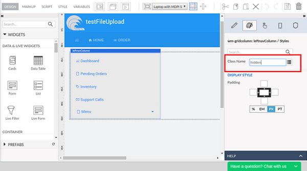
Navigate to the Style tab of the properties panel and set the Class Name property for this grid column as “hidden”.
Open the Style tab of the Main page
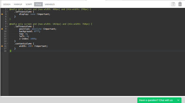 and write the following style snippet:
@media only screen and (max-width: 480px) and (min-width: 299px) { .leftnavcolumn { display: none !important; } }
@media only screen and (max-width: 1024px) and (min-width: 768px) { .leftnavcolumn { position: absolute !important; background: #fff; top: 0; left: 0; z-index: 1000; } .contentcolumn { width: 100% !important; } }
Open the topnav partial page and add an anchor widget. Specify the icon Class as “wi wi-list-ol” for the newly added anchor.
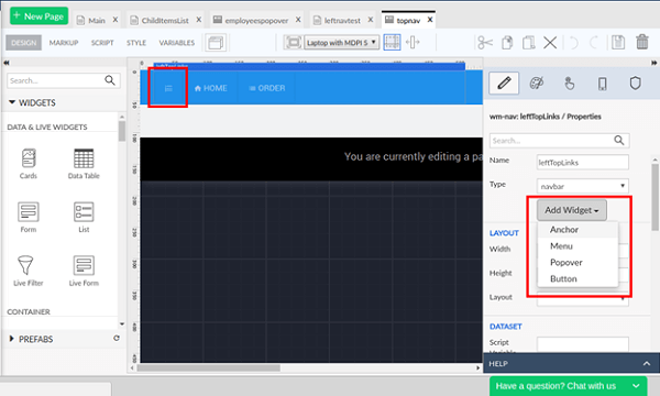
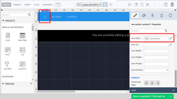
Choose the newly added anchor from the topnav and navigate to the properties panel.
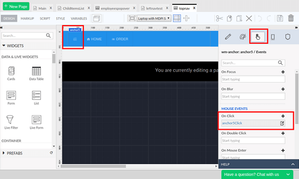
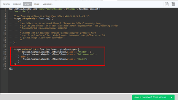
For the onClick event of the anchor, choose JavaScript as operation. For the function generated in the Script tab of the page, place the below mentioned code snippet:
Partial.anchor5Click = function($event, widget) {
    if(Partial.App.activePage.Widgets.leftnavColumn.class == "hidden") {
        Partial.App.activePage.Widgets.leftnavColumn.class = "leftnavcolumn";
    }else{
        Partial.App.activePage.Widgets.leftnavColumn.class = "hidden";
    }
};
leftnavColumn is the name of the grid column within which the leftnav content container was placed as mentioned above.
Mobile Widgets
