Modal Windows/ Dialogs
WaveMaker provides the facility to add pop-up windows to your project through the Dialog widgets. Pop-up windows are a way to give additional information to users without cluttering your project space. This can be for alerts, getting additional information like user name, or for login purposes. There are six types of Dialog widgets provided by WaveMaker.
Overview
Dragging and dropping a dialog creates a view containing the dialog. The view can be selected from the Page Structure or from the tabs given at the bottom. The display of the dialog box at runtime is usually associated with the onClick event of a Button widget. You can also trigger the dialog by calling methods from JavaScript.
Note: Even though the dialog widget is placed in a view, that view is not available for navigation.
Features
Alert Dialog
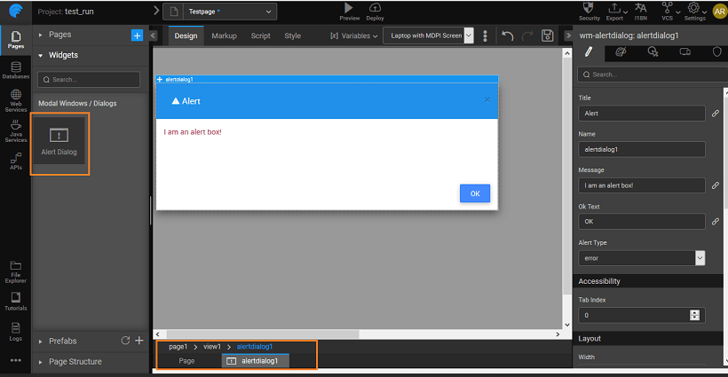
For Alert Dialog, you can set:
- the name, the title of the alert pop-up, message to be displayed in the pop-up, text on the OK button and the type of alert - error, information, success or warning.
- the icon for display next to the title of the alert box, you can pick the icon from the icon dialog.
Confirm Dialog
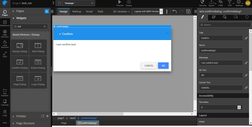
Confirm Dialog is used to get confirmation from the user. In addition to the properties mentioned for Alert Dialog, it has an additional Cancel button. The most common usage is to confirm a delete action.
Design Dialog
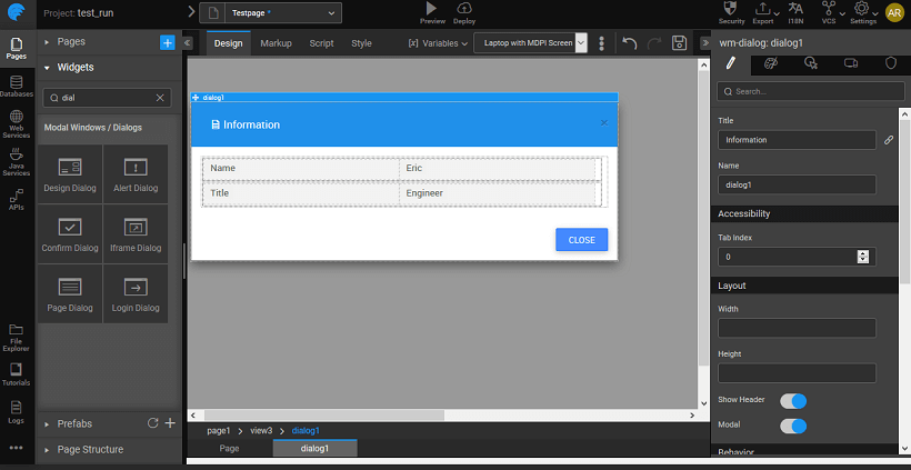
Design Dialog gives a Form for obtaining additional information from the user, like the name. It is a composite widget with Labels and Text widgets. It comes with two buttons Cancel and Save.
IFrame Dialog
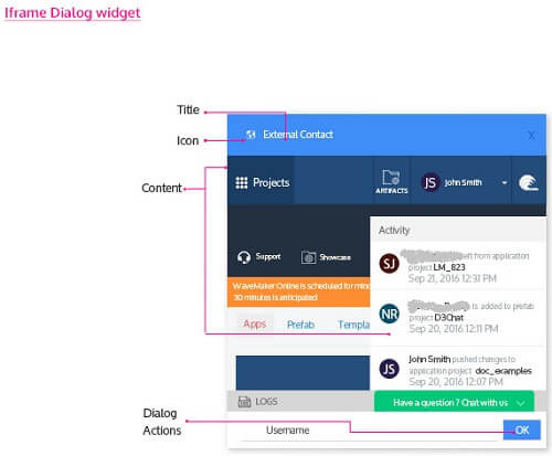
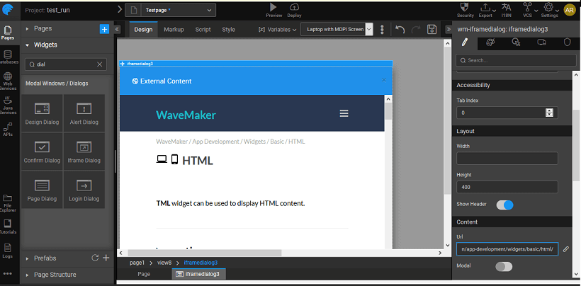
An Iframe Dialog is a popup window that displays content from an external source (URL) in a dialog. It has an URL property, where you mention the external source for the content.
Note: Since WaveMaker is secured, only secure URLs can be displayed in the Iframe.
Login Dialog
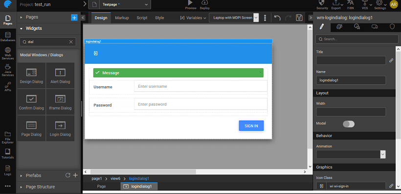
Login Dialog is a popup window that displays Login page content and can be dismissed by the user. Especially used to refresh the membership or for additional confirmation. The events that can be set include onSuccess, onError and onClose.
Page Dialog
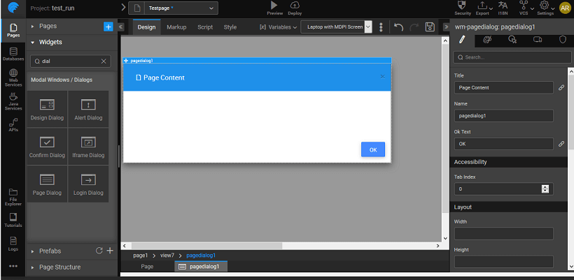
Page Dialog is a popup window that displays page content and can be dismissed by the user. The content property of this widget can be set to the desired partial page content.
Script Access
Dialog widget in your project can be accessed by associating the open and close properties of the dialog with an event of any other widget. The dialog can be accessed through scripting by adding DialogService to the page controller and adding the code for open and close as shown below, here we are displaying an alert dialog on click of a button: Click event of the button should trigger the following JavaScript code:
Page.button3Click = function($event, widget) { Page.Widgets.alertdialog1.open(); }
For hiding dialog:
/ function called on button1 click / Page.button1Click = function($event, widget) { Page.Widgets.alertdialog1.close(); };
Properties & Events
Alert Dialog Properties
| Property | Description |
|---|---|
| Title | Set the title of an alert dialog. |
| Name | The name is a unique identifier for alert dialog. |
| Message | Set the message of the widget. |
| Ok Text | This widget gives a pop-up window. It can be used to give a warning message to the user. For example, you are about to leave this page. |
| Alert Type | This property will help in identifying the type of alert in the alert box. Can be set to error (default), information, success, and warning. |
| Accessibility | |
| Tab index | The tab index attribute specifies the tab order of an element. You can use this property to change the default tabbing order for widget access using the tab key. The value can range from 0 to 32767. The default is 0 and -1 makes the element non-focusable. |
| NOTE: In Safari browsers, by default, Tab highlights only text fields. To enable Tab functionality, in Safari Browser from Preferences -> Advanced -> Accessibility set the option "Press Tab to highlight each item on a webpage". | |
| Layout | |
| Width | The width of your widget can be specified in px or % (i.e 50px, 75%). |
| Height | The height of your widget can be specified in px or % (i.e 50px, 75%). |
| Modal | This property, if set true, adds a backdrop for the dialog restricting the closure of the dialog when the user clicks outside of the dialog. The default value is false, which allows close of dialog on click outside. |
| Behavior | |
| Enable Default Close Action | This property allows the user to access close action from header through an "x" icon; and also enables close through ESC key. |
| Animation | This property controls the animation of an element. The animation is based on the CSS classes and works only in the run mode. |
| Keyboard | This property if set true allows closing of dialog on ESC keypress. The default is true. |
| Graphics | |
| Icon Class | This property defines the class of the icon that is applied to the button. |
| Icon Width | Optional property; but you will need this if you are using the button's iconUrl. Please enter the width of your icon. WARNING: It's best to specify size in pixels, not percent. |
| Icon Height | Optional property; but you will need this if you are using the button's iconUrl. Please enter the height of your icon. WARNING: It's best to specify size in pixels, not percent. |
| Icon Margin | Optional property; only has meaning if you specify the button's iconUrl. Values should all have "px" next to them. Use this to adjust the space between the icon and the button text. |
| Event | Description |
|---|---|
| Callback Events | |
| On ok | This event handler is called whenever an ok event is triggered. |
| On close | This event handler is called whenever a close event is triggered. |
| On open | This widget gives a pop-up window. It can be used to give a warning message to the user. For example, you are about to leave this page. |
Confirm Dialog Properties
| Property | Description |
|---|---|
| Title | Set the title of the widget. |
| Name | The name is a unique identifier for the confirm dialog. |
| Message | Set the display message for the widget. |
| Ok Text | This Confirm Dialog prompts to get confirmation from the user. |
| Cancel Text | This widget gives a pop-up window. It can be used to get confirmation of an action from the user. For example, do you want to delete this item? |
| Accessibility | |
| Tab index | The tab index attribute specifies the tab order of an element. You can use this property to change the default tabbing order for widget access using the tab key. The value can range from 0 to 32767. The default is 0 and -1 makes the element non-focusable. |
| NOTE: In Safari browsers, by default, Tab highlights only text fields. To enable Tab functionality, in Safari Browser from Preferences -> Advanced -> Accessibility set the option "Press Tab to highlight each item on a webpage". | |
| Layout | |
| Width | The width of your widget can be specified in px or % (i.e 50px, 75%). |
| Height | The height of your widget can be specified in px or % (i.e 50px, 75%). |
| Modal | This property, if set true, adds a backdrop for the dialog restricting the closure of the dialog when the user clicks outside of the dialog. The default value is false, which allows close of dialog on click outside. |
| Behavior | |
| Enable Default Close Action | This property allows the user to access close action from header through an "x" icon; and also enables close through ESC key. |
| Animation | This property controls the animation of an element. The animation is based on the CSS classes and works only in the run mode. |
| Keyboard | This property if set true allows closing of dialog on ESC keypress. The default is true. |
| Graphics | |
| Icon Class | This property defines the class of the icon that is applied to the button. |
| Icon Width | Optional property; but you will need this if you are using the button's iconUrl. Please enter the width of your icon. WARNING: It's best to specify size in pixels, not percent. |
| Icon Height | Optional property; but you will need this if you are using the button's iconUrl. Please enter the height of your icon. WARNING: It's best to specify size in pixels, not percent. |
| Icon Margin | Optional property; only has meaning if you specify the button's iconUrl. Values should all have "px" next to them. Use this to adjust the space between the icon and the button text. |
| Event | Description |
|---|---|
| Callback Events | |
| On ok | This event handler is called whenever an ok event is triggered. |
| On cancel | This event handler is called whenever a cancel event is triggered. |
| On close | This event handler is called whenever a close event is triggered. |
| On open | This widget gives a pop-up window. It can be used to give a warning message to the user. For example, you are about to leave this page. |
Design Dialog Properties
| Property | Description |
|---|---|
| Title | Set the title of the design dialog. |
| Name | The name is a unique identifier for design dialog. |
| Accessibility | |
| Tab index | The tab index attribute specifies the tab order of an element. You can use this property to change the default tabbing order for widget access using the tab key. The value can range from 0 to 32767. The default is 0 and -1 makes the element non-focusable. |
| NOTE: In Safari browsers, by default, Tab highlights only text fields. To enable Tab functionality, in Safari Browser from Preferences -> Advanced -> Accessibility set the option "Press Tab to highlight each item on a webpage". | |
| Layout | |
| Width | The width of your widget can be specified in px or % (i.e 50px, 75%). |
| Height | The height of your widget can be specified in px or % (i.e 50px, 75%). |
| Show Header | Show/hide header of the design dialog. |
| Modal | This property, if set true, adds a backdrop for the dialog restricting the closure of the dialog when the user clicks outside of the dialog. The default value is false, which allows close of dialog on click outside. |
| Behavior | |
| Enable Default Close Action | This property allows the user to access close action from header through an "x" icon; and also enables close through ESC key. |
| Animation | This property controls the animation of an element. The animation is based on the CSS classes and works only in the run mode. |
| Graphics | |
| Icon Class | This property defines the class of the icon that is applied to the button. |
| Icon Width | Optional property; but you will need this if you are using the button's iconUrl. Please enter the width of your icon. WARNING: It's best to specify size in pixels, not percent. |
| Icon Height | Optional property; but you will need this if you are using the button's iconUrl. Please enter the height of your icon. WARNING: It's best to specify size in pixels, not percent. |
| Icon Margin | Optional property; only has meaning if you specify the button's iconUrl. Values should all have "px" next to them. Use this to adjust the space between the icon and the button text. |
| Event | Description |
|---|---|
| Callback Events | |
| On close | This event handler is called whenever a close event is triggered. |
| On open | This widget gives a pop-up window. It can be used to give a warning message to the user. For example, you are about to leave this page. |
Iframe Dialog Properties
Check this if you want the provided URL to be encoded at the run time.
| Property | Description |
|---|---|
| Title | Set the title of iframe dialog. |
| Name | The name is a unique identifier for iframe dialog. |
| Ok Text | This widget gives a pop-up window. It can be used to provide contextual information from an HTML source to the user. For example, here is a sample from the source. |
| Accessibility | |
| Tab index | The tab index attribute specifies the tab order of an element. You can use this property to change the default tabbing order for widget access using the tab key. The value can range from 0 to 32767. The default is 0 and -1 makes the element non-focusable. NOTE: In Safari browsers, by default, Tab highlights only text fields. To enable Tab functionality, in Safari Browser from Preferences -> Advanced -> Accessibility set the option "Press Tab to highlight each item on a webpage". |
| Layout | |
| Width | The width of your widget can be specified in px or % (i.e 50px, 75%). |
| Height | The height of your widget can be specified in px or % (i.e 50px, 75%). |
| Show Header | Show/hide header of the iframe dialog. |
| Modal | This property, if set true, adds a backdrop for the dialog restricting the closure of the dialog when the user clicks outside of the dialog. The default value is false, which allows close of dialog on click outside. |
| Content | |
| Url | Any URL entered for this property will be shown in the dialog content. |
| Behavior | |
| Enable Default Close Action | This property allows the user to access close action from header through an "x" icon; and also enables close through ESC key. |
| Show actions | This property shows/hides actions section of the iframe dialog. |
| Animation | This property controls the animation of an element. The animation is based on the CSS classes and works only in the run mode. |
| Encode URL | Check this if you want the provided URL to be encoded at the run time. Enabling this property will encode the special characters in the URL and enable rendering of the page which otherwise might fail. By default, it is set to false. |
| Keyboard | This property if set true allows closing of dialog on ESC keypress. The default is true. |
| Graphics | |
| Icon Class | This property defines the class of the icon that is applied to the button. |
| Icon Width | Optional property; but you will need this if you are using the button's iconUrl. Please enter the width of your icon. WARNING: It's best to specify size in pixels, not percent. |
| Icon Height | Optional property; but you will need this if you are using the button's iconUrl. Please enter the height of your icon. WARNING: It's best to specify size in pixels, not percent. |
| Icon Margin | Optional property; only has meaning if you specify the button's iconUrl. Values should all have "px" next to them. Use this to adjust the space between the icon and the button text. |
| Event | Description |
|---|---|
| Callback Events | |
| On ok | This event handler is called whenever an ok event is triggered. |
| On close | This event handler is called whenever a close event is triggered. |
| On open | This widget gives a pop-up window. It can be used to give a warning message to the user. For example, you are about to leave this page. |
Page Dialog Properties
| Property | Description |
|---|---|
| Title | Set the title of the widget. |
| Name | The name is a unique identifier for the widget. |
| Ok Text | This widget gives a pop-up window. It can be used to provide contextual information to the user. |
| Accessibility | |
| Tab index | The tab index attribute specifies the tab order of an element. You can use this property to change the default tabbing order for widget access using the tab key. The value can range from 0 to 32767. The default is 0 and -1 makes the element non-focusable. |
| NOTE: In Safari browsers, by default, Tab highlights only text fields. To enable Tab functionality, in Safari Browser from Preferences -> Advanced -> Accessibility set the option "Press Tab to highlight each item on a webpage". | |
| Layout | |
| Width | The width of your widget can be specified in px or % (i.e 50px, 75%). |
| Height | The height of your widget can be specified in px or % (i.e 50px, 75%). |
| Modal | This property, if set true, adds a backdrop for the dialog restricting the closure of the dialog when the user clicks outside of the dialog. The default value is false, which allows close of dialog on click outside. |
| Content | |
| Content | Page's content to be included in the widget. |
| Behavior | |
| Enable Default Close Action | This property allows the user to access close action from header through an "x" icon; and also enables close through ESC key. |
| Show actions | This property shows/hides actions section of the widget. |
| Animation | This property controls the animation of an element. The animation is based on the CSS classes and works only in the run mode. |
| Keyboard | This property if set true allows closing of dialog on ESC keypress. The default is true. |
| Graphics | |
| Icon Class | This property defines the class of the icon that is applied to the button. |
| Icon Width | Optional property; but you will need this if you are using the button's iconUrl. Please enter the width of your icon. WARNING: It's best to specify size in pixels, not percent. |
| Icon Height | Optional property; but you will need this if you are using the button's iconUrl. Please enter the height of your icon. WARNING: It's best to specify size in pixels, not percent. |
| Icon Margin | Optional property; only has meaning if you specify the button's iconUrl. Values should all have "px" next to them. Use this to adjust the space between the icon and the button text. |
| Event | Description |
|---|---|
| On load | This event handler is called when the widget is loaded. |
| Callback Events | |
| On ok | This event handler is called whenever an ok event is triggered. |
| On close | This event handler is called whenever a close event is triggered. |
| On open | This widget gives a pop-up window. It can be used to give a warning message to the user. For example, you are about to leave this page. |
Login Dialog Properties
| Property | Description |
|---|---|
| Title | Set the title of the widget. |
| Name | The name is a unique identifier for the widget. |
| Layout | |
| Width | The width of your widget can be specified in px or % (i.e 50px, 75%). |
| Modal | This property, if set true, adds a backdrop for the dialog restricting the closure of the dialog when the user clicks outside of the dialog. The default value is false, which allows close of dialog on click outside. |
| Behavior | |
| Animation | This property controls the animation of an element. The animation is based on the CSS classes and works only in the run mode. |
| Keyboard | This property if set true allows closing of dialog on ESC keypress. The default is true. |
| Graphics | |
| Icon Class | This property defines the class of the icon that is applied to the button. |
| Icon Width | Optional property; but you will need this if you are using the button's iconUrl. Please enter the width of your icon. WARNING: It's best to specify size in pixels, not percent. |
| Icon Height | Optional property; but you will need this if you are using the button's iconUrl. Please enter the height of your icon. WARNING: It's best to specify size in pixels, not percent. |
| Icon Margin | Optional property; only has meaning if you specify the button's iconUrl. Values should all have "px" next to them. Use this to adjust the space between the icon and the button text. |
| Event | Description |
|---|---|
| Callback Events | |
| On submit | This event handler is called whenever a submit event is triggered. |
| On close | This event handler is called whenever a close event is triggered. |
| On open | This widget gives a pop-up window. It can be used to give a warning message to the user. For example, you are about to leave this page. |
| On success | This event handler is called whenever a success event is triggered. |
| On error | This event handler is called whenever an error event is triggered. |
