Grid Layout
Grid Layout is the basic content layout, that caters to multiple layout needs. Using the grid layout, you can divide your page content into cells or grids and place your widgets accordingly. It gives you a flexibility of widget placement without having to get into the intricate design details. The major advantage of using grid layout is its rendering capability. WaveMaker renders the screen depending upon the device being used for viewing the app like mobile, tablet, etc..
WaveMaker implements the Bootstrap Grid system which is the 12-column system:
Features
Grid Layout - Basic Features
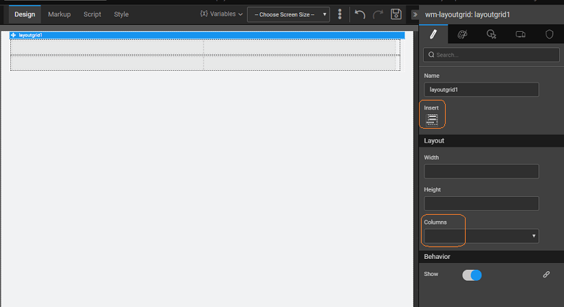
Grid Layout when dropped on the canvas, gives you a two-row, two-column grid to which you can:
- Grid-level features
set the number of columns needed for your grid, this will be propagated to all the rows of the grid;
change the height and width of the grid;
move the columns and rows anywhere in the grid;
insert rows to the existing grid. When inserting a new row, the last row pattern is replicated, i.e. if you have the last row with two columns then the new row added will also be a two-column row.
- Row-level features
change the height of the row,
add columns to the row from the properties panel of the selected row. When adding columns, WaveMaker ensures that the sum of all the column widths does not exceed 12.
insert a row either before or after the selected row
delete a selected row, by clicking delete key after selecting the row
- Column-level Features
Grid Layout Column Width Settings
WaveMaker ensures that the sum of all columns in a given row does not exceed 12. For this, following scenarios are handled:
- While adding columns: Columns can be added either by selecting a row or from selecting a column:
- Row or column is selected: If previous columns are of the same width, the new column width and other columns width is set as 12 / (number of columns) ie.. if previous both columns are 6 and insert column is triggered the column width of all columns will be 12 / 3 = 4.
- The row is selected and all columns are of different width: In this case, the column width will be set to last column width / 2 if it is > 1; if it is < = 1 new column will not be allowed to insert.
- Column is selected and all columns are of different width: In this case, the new column width will be width / 2 of selected column if its > 1 else new column will not be allowed to insert
- While adding columns:
- If total column width is 12 along with the changed width: In this case, it won't adjust the width, it will change the current column width.
- If total column width is greater than 12 along with changed width: If it can borrow the same from sibling element it will adjust the width else it won't allow the change of width.
- If total column width is less than 12 along with the changed width: It will add the width to sibling element that is reduced from current column.
The following image gives you an idea of the flexible design that grid layout offers. The first row has three columns with the width being 4+4+4; second row three columns - 1+10+1; the third row with two columns - 6+6 and the last row same as the first row.
Properties
| Property | Description |
|---|---|
| Name | The name is a unique identifier for the grid layout widget. |
| Insert | Add a row to the grid layout, at the bottom. |
| Layout | |
| Width | The width of your widget can be specified in px or % (i.e 50px, 75%). |
| Height | The height of your widget can be specified in px or % (i.e 50px, 75%). |
| Columns | Number of columns in each row of the layout grid widget. Columns are droppable. The number of columns restricted to a range, to suit bootstrap fluid grid system. |
| Behavior | |
| Show | Showing determines whether or not a component is visible. It is a bindable property. |
| Load on Demand (visible only when show property is bound to a variable) | When this property is set and show property is bound, the initialization of the widget will be deferred till the widget becomes visible. This behavior improves the load time. Use this feature with caution, as it has a downside (as we will not be able to interact with the widget through script until the widget is initialized). When show property is not bound the widget will be initialized immediately. |
Row Properties
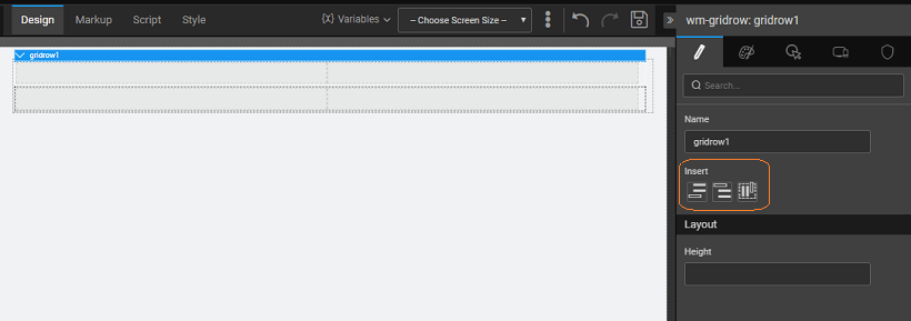
A sub widget of the grid layout is the direct child of the grid.
| Property | Description |
|---|---|
| Name | The name is a unique identifier for the grid row. |
| Insert | Add a row either above or below the current row or add a column to the current row. |
| Layout | |
| Height | The height of your widget can be specified in px or % (i.e 50px, 75%). |
Column Properties
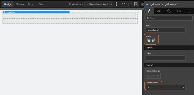
A sub widget of the grid layout is the direct child of the grid row.
| Property | Description |
|---|---|
| Name | The name is a unique identifier for the grid column |
| Insert | Add a column either before or after the current column. |
| Layout | |
| Height | The height of your widget can be specified in px or % (i.e 50px, 75%). |
| Format | |
| Horizontal Align | Set text alignment horizontally. |
| Column Width | Accepts integer(x) between 1-12 and adds class col-md-(x), to suit bootstrap fluid grid system. |


