How to build responsive UI using Visual RAD approach in WaveMaker?
See the FAQs for WaveMaker app development.
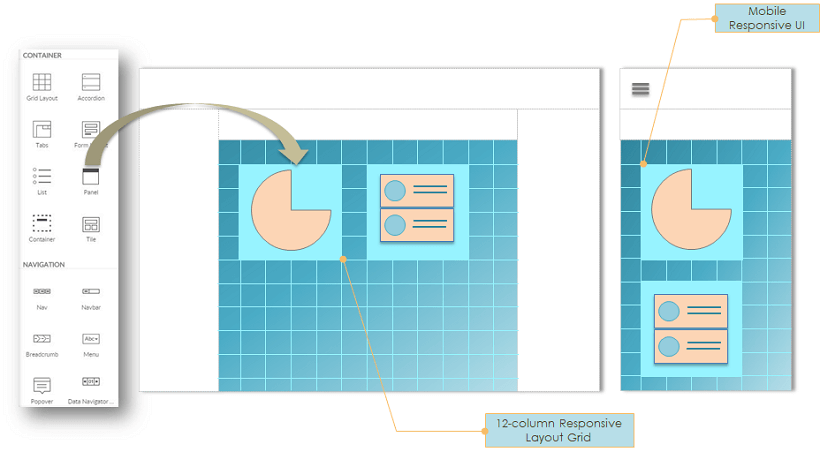
The responsive design facilitates the apps to automatically adjust to the device screen size with various UI components adjusting to the available real estate. In WaveMaker, this is achieved through Bootstrap styling using the 12-column layout.
Widgets are dragged and dropped into the 12-column grid containers, whose sizes cumulatively aggregate to 12 within a row. The bootstrap layouting system automatically renders the widgets in different devices based on the available real estate, usually stacking them on a mobile device, while they appear side by side when viewed on a desktop screen.
In WaveMaker, a Page has a flexible layout structure separated from the main content area where the widgets are dropped. Separation of the layout i.e. left panel, header, footer etc. helps not only in achieving UI consistency but also in simplifying the page rendering across devices.
Also, WaveMaker widgets embrace Android Material Design specification for visual design and building interaction across multiple devices. Android Material Design provides standard design guidelines for user interaction across mobile apps and modern web apps.
